A Return to the Beginning
What ever happened to a blank, white piece of paper? Why is it that every app or tech tool claiming to inspire creativity simply has the user fill in a template?
I’ve recently switched jobs, and in the process (thanks in part to @sadieclorinda), have become enamored of a couple of concepts, one of which is teaching students the design process with the end user in mind. Instead of simply assigning a PowerPoint project where the students choose a template and cram each slide with as many facts as possible, have them think first of the end user. What will their experience be like? What types of presentations do they like to view, and why?
One of the first steps is to toss the word ‘project’ and replace it with ‘product’.
The next step is to have them go through the design process, and start with blank slides (or docs, or whatever), thinking about what mood they want to portray, the feelings they want to convey to the audience. Then, they can match color scheme with fonts and layout to create a product that is pleasing to the end user.
As an example, here is how I would make a slide that would present my winter haiku
Step 1: Write Haiku
blizzards swirling ’round / erasing summer palettes / blinding I now see
The message I want to convey is confusion, cold, with limited color.
Step 2: Find my Palette
There are color palettes already chosen in just about every creative tool, but what’s the fun in that? My new favorite tech tools are the palette generators. I use Adobe Capture for my phone, and coloors.co for my desktop. Nature seems to do a bang up job of combining colors, so if you take a picture of something in Nature, the color combination should be a winner. Today, I took a picture of the morning sky with its great cool colors, and put it in Adobe Capture:

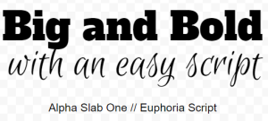
Then, I thought about font. I like the idea of pairing two contrasting fonts, one to show the swirling snow (a script font) and another to show the weight of blindness and the feeling of loss of control and color (a bold headline font).
Then, on a Google Slide, I can easily arrange all my elements (a GSlide is much easier for this than a GDoc!). Normally, I would use Canva.com, but I’m using what a student would likely have as part of their Google Classroom toolbox.

In making this slide, I actually lightened the lights, and darkened the dark since I couldn’t alter the transparency of the photograph.
Looking at the finished product, I wouldn’t give myself a good grade for finding a photograph that illustrated the poem (or in this case, writing a poem that fit the photo!). BUT, I started from scratch, and used the design process to visualize what I wanted the end user to view.
***LATER***
OK. So, I gave it back to myself and redid it – just as I would expect a student to do.

Another perk to starting from scratch is that everything here is my own work, so I don’t have to worry about copyright!
